Column
A control that displays its children in a vertical array.
To cause a child control to expand and fill the available vertical space set its expand property.
Examples
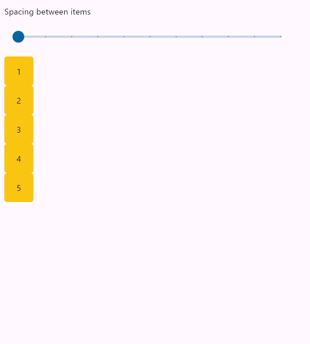
Column spacing
- Python
import flet as ft

def main(page: ft.Page):
    def items(count):
        items = []
        for i in range(1, count + 1):
            items.append(
                ft.Container(
                    content=ft.Text(value=str(i)),
                    alignment=ft.alignment.center,
                    width=50,
                    height=50,
                    bgcolor=ft.colors.AMBER,
                    border_radius=ft.border_radius.all(5),
                )
            )
        return items

    def spacing_slider_change(e):
        col.spacing = int(e.control.value)
        col.update()

    gap_slider = ft.Slider(
        min=0,
        max=100,
        divisions=10,
        value=0,
        label="{value}",
        width=500,
        on_change=spacing_slider_change,
    )

    col = ft.Column(spacing=0, controls=items(5))

    page.add(ft.Column([ ft.Text("Spacing between items"), gap_slider]), col)

ft.app(target=main)
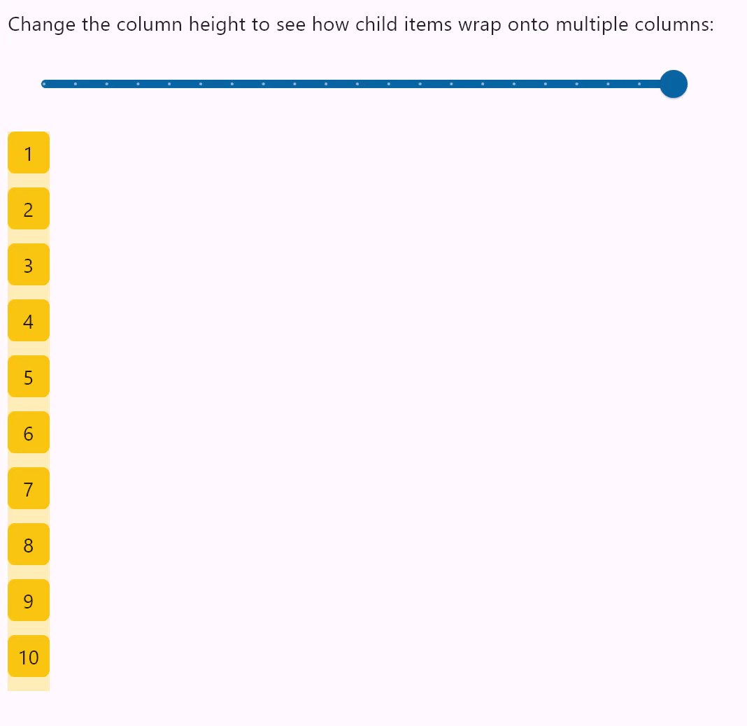
Column wrapping
- Python
import flet as ft

HEIGHT = 400

def main(page: ft.Page):
    def items(count):
        items = []
        for i in range(1, count + 1):
            items.append(
                ft.Container(
                    content=ft.Text(value=str(i)),
                    alignment=ft.alignment.center,
                    width=30,
                    height=30,
                    bgcolor=ft.colors.AMBER,
                    border_radius=ft.border_radius.all(5),
                )
            )
        return items

    def slider_change(e):
        col.height = float(e.control.value)
        col.update()

    width_slider = ft.Slider(
        min=0,
        max=HEIGHT,
        divisions=20,
        value=HEIGHT,
        label="{value}",
        width=500,
        on_change=slider_change,
    )

    col = ft.Column(
        wrap=True,
        spacing=10,
        run_spacing=10,
        controls=items(10),
        height=HEIGHT,
    )

    page.add(
        ft.Column(
            [
                ft.Text(
                    "Change the column height to see how child items wrap onto multiple columns:"
                ),
                width_slider,
            ]
        ),
        ft.Container(content=col, bgcolor=ft.colors.AMBER_100),
    )

ft.app(target=main)
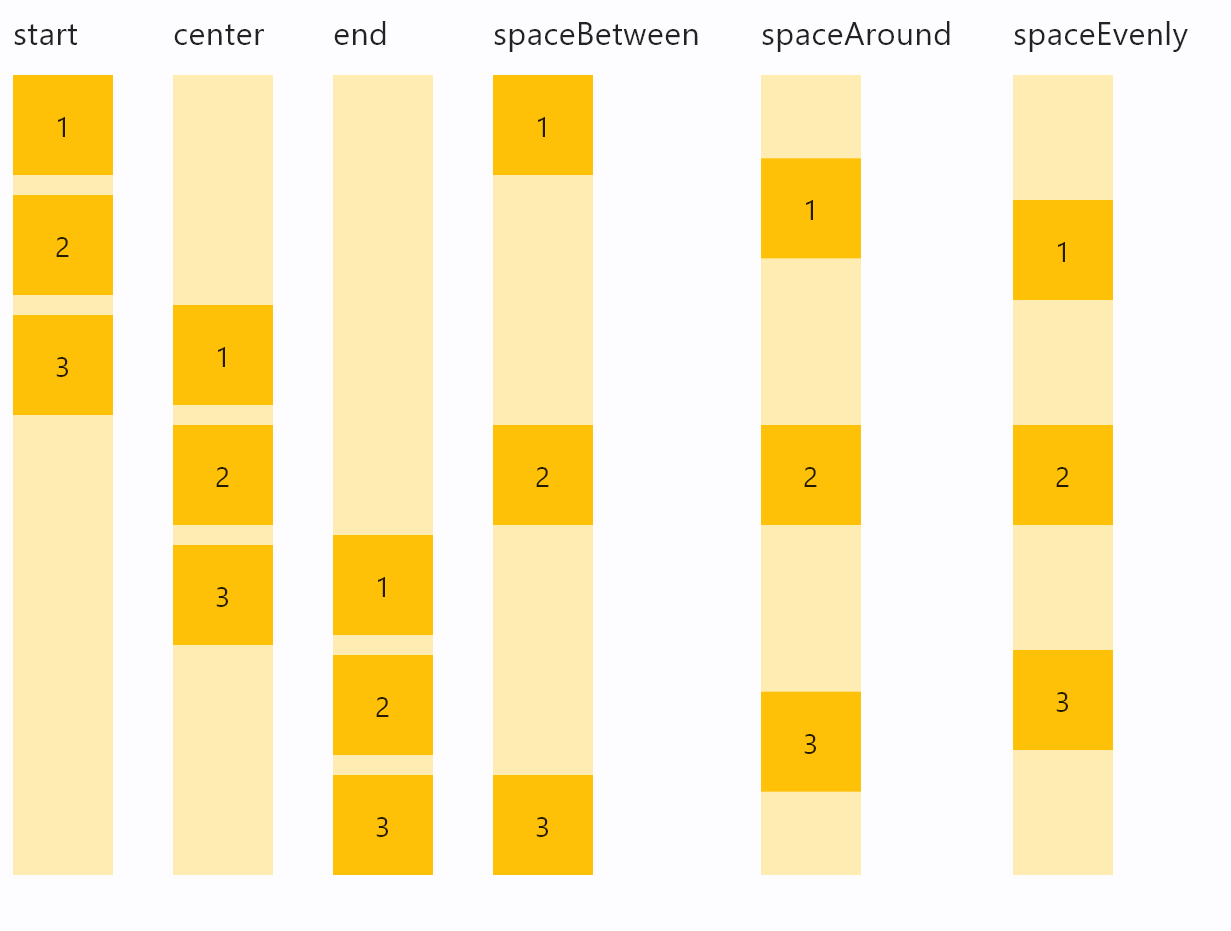
Column vertical alignments
- Python
import flet as ft

def main(page: ft.Page):
    def items(count):
        items = []
        for i in range(1, count + 1):
            items.append(
                ft.Container(
                    content=ft.Text(value=str(i)),
                    alignment=ft.alignment.center,
                    width=50,
                    height=50,
                    bgcolor=ft.colors.AMBER_500,
                )
            )
        return items

    def column_with_alignment(align: ft.MainAxisAlignment):
        return ft.Column(
            [
                ft.Text(str(align), size=10),
                ft.Container(
                    content=ft.Column(items(3), alignment=align),
                    bgcolor=ft.colors.AMBER_100,
                    height=400,
                ),
            ]
        )

    page.add(
        ft.Row(
            [
                column_with_alignment(ft.MainAxisAlignment.START),
                column_with_alignment(ft.MainAxisAlignment.CENTER),
                column_with_alignment(ft.MainAxisAlignment.END),
                column_with_alignment(ft.MainAxisAlignment.SPACE_BETWEEN),
                column_with_alignment(ft.MainAxisAlignment.SPACE_AROUND),
                column_with_alignment(ft.MainAxisAlignment.SPACE_EVENLY),
            ],
            spacing=30,
            alignment=ft.MainAxisAlignment.START,
        )
    )

ft.app(target=main)
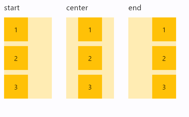
Column horizontal alignments
- Python
import flet as ft

def main(page: ft.Page):
    def items(count):
        items = []
        for i in range(1, count + 1):
            items.append(
                ft.Container(
                    content=ft.Text(value=str(i)),
                    alignment=ft.alignment.center,
                    width=50,
                    height=50,
                    bgcolor=ft.colors.AMBER_500,
                )
            )
        return items

    def column_with_horiz_alignment(align: ft.CrossAxisAlignment):
        return ft.Column(
            [
                ft.Text(str(align), size=16),
                ft.Container(
                    content=ft.Column(
                        items(3),
                        alignment=ft.MainAxisAlignment.START,
                        horizontal_alignment=align,
                    ),
                    bgcolor=ft.colors.AMBER_100,
                    width=100,
                ),
            ]
        )

    page.add(
        ft.Row(
            [
                column_with_horiz_alignment(ft.CrossAxisAlignment.START),
                column_with_horiz_alignment(ft.CrossAxisAlignment.CENTER),
                column_with_horiz_alignment(ft.CrossAxisAlignment.END),
            ],
            spacing=30,
            alignment=ft.MainAxisAlignment.START,
        )
    )

ft.app(target=main)
Infinite scroll list
The following example demonstrates adding of list items on-the-fly, as user scroll to the bottom, creating the illusion of inifinite list:
import threading
import flet as ft

class State:
    i = 0

s = State()
sem = threading.Semaphore()

def main(page: ft.Page):
    def on_scroll(e: ft.OnScrollEvent):
        if e.pixels >= e.max_scroll_extent - 100:
            if sem.acquire(blocking=False):
                try:
                    for i in range(0, 10):
                        cl.controls.append(ft.Text(f"Text line {s.i}", key=str(s.i)))
                        s.i += 1
                    cl.update()
                finally:
                    sem.release()

    cl = ft.Column(
        spacing=10,
        height=200,
        width=200,
        scroll=ft.ScrollMode.ALWAYS,
        on_scroll_interval=0,
        on_scroll=on_scroll,
    )
    for i in range(0, 50):
        cl.controls.append(ft.Text(f"Text line {s.i}", key=str(s.i)))
        s.i += 1

    page.add(ft.Container(cl, border=ft.border.all(1)))

ft.app(main)
Scrolling column programmatically
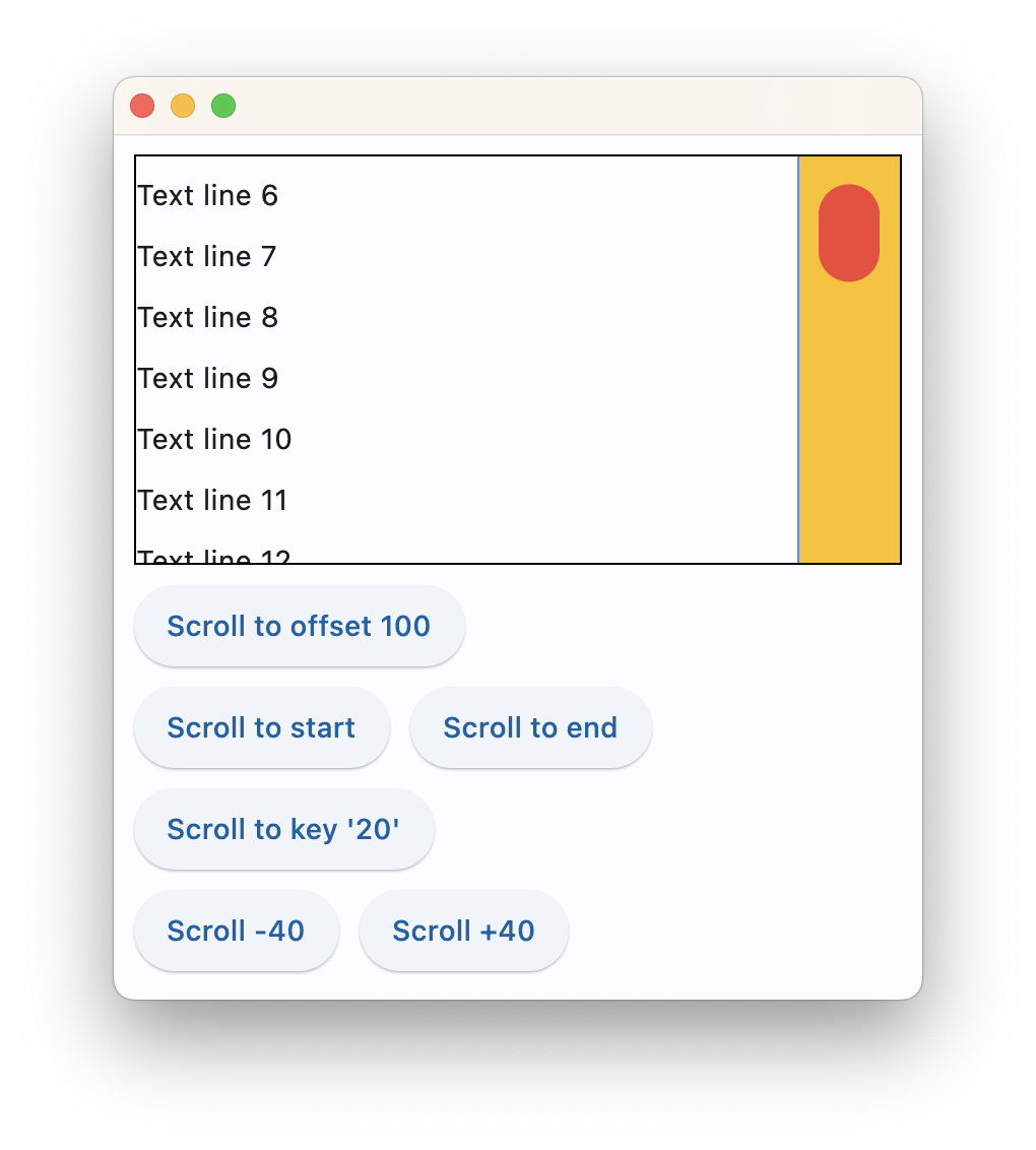
The following example demonstrates various scroll_to() options as well as defines a custom scrollbar theme:
import flet as ft

def main(page: ft.Page):
    page.theme = ft.Theme(
        scrollbar_theme=ft.ScrollbarTheme(
            track_color={
                ft.MaterialState.HOVERED: ft.colors.AMBER,
                ft.MaterialState.DEFAULT: ft.colors.TRANSPARENT,
            },
            track_visibility=True,
            track_border_color=ft.colors.BLUE,
            thumb_visibility=True,
            thumb_color={
                ft.MaterialState.HOVERED: ft.colors.RED,
                ft.MaterialState.DEFAULT: ft.colors.GREY_300,
            },
            thickness=30,
            radius=15,
            main_axis_margin=5,
            cross_axis_margin=10,
            # interactive=False,
        )
    )

    cl = ft.Column(
        spacing=10,
        height=200,
        width=float("inf"),
        scroll=ft.ScrollMode.ALWAYS,
    )
    for i in range(0, 100):
        cl.controls.append(ft.Text(f"Text line {i}", key=str(i)))

    def scroll_to_offset(e):
        cl.scroll_to(offset=100, duration=1000)

    def scroll_to_start(e):
        cl.scroll_to(offset=0, duration=1000)

    def scroll_to_end(e):
        cl.scroll_to(offset=-1, duration=2000, curve=ft.AnimationCurve.EASE_IN_OUT)

    def scroll_to_key(e):
        cl.scroll_to(key="20", duration=1000)

    def scroll_to_delta(e):
        cl.scroll_to(delta=40, duration=200)

    def scroll_to_minus_delta(e):
        cl.scroll_to(delta=-40, duration=200)

    page.add(
        ft.Container(cl, border=ft.border.all(1)),
        ft.ElevatedButton("Scroll to offset 100", on_click=scroll_to_offset),
        ft.Row(
            [
                ft.ElevatedButton("Scroll to start", on_click=scroll_to_start),
                ft.ElevatedButton("Scroll to end", on_click=scroll_to_end),
            ]
        ),
        ft.ElevatedButton("Scroll to key '20'", on_click=scroll_to_key),
        ft.Row(
            [
                ft.ElevatedButton("Scroll -40", on_click=scroll_to_minus_delta),
                ft.ElevatedButton("Scroll +40", on_click=scroll_to_delta),
            ]
        ),
    )

ft.app(main)
Properties
alignment
How the child Controls should be placed vertically.
Property value is MainAxisAlignment enum with the following values:
START(default)ENDCENTERSPACE_BETWEENSPACE_AROUNDSPACE_EVENLY
auto_scroll
True if scrollbar should automatically move its position to the end when children updated. Must be False for scroll_to() method to work.
controls
A list of Controls to display inside the Column.
horizontal_alignment
How the child Controls should be placed horizontally.
Property value is CrossAxisAlignment enum with the following values:
START(default)CENTERENDSTRETCHBASELINE
on_scroll_interval
Throttling in milliseconds for on_scroll event. Default is 10.
rtl
True to set text direction to right-to-left. Default is False.
run_spacing
Spacing between runs when wrap=True. Default value is 10.
scroll
Enables a vertical scrolling for the Column to prevent its content overflow.
Property value is an optional ScrollMode enum with None as default.
Supported values:
None(default) - the column is non-scrollable and its content could overflow.AUTO- scrolling is enabled and scroll bar is only shown when scrolling occurs.ADAPTIVE- scrolling is enabled and scroll bar is always shown when running app as web or desktop.ALWAYS- scrolling is enabled and scroll bar is always shown.HIDDEN- scrolling is enabled, but scroll bar is always hidden.
spacing
Spacing between controls in a Column. Default value is 10 virtual pixels. Spacing is applied only when alignment is set to start, end or center.
tight
Specifies how much space should be occupied vertically. Default is False - allocate all space to children.
wrap
When set to True the Column will put child controls into additional columns (runs) if they don't fit a single column.
Methods
scroll_to(offset, delta, key, duration, curve)
Moves scroll position to either absolute offset, relative delta or jump to the control with specified key.
offset is an abosulte value between minimum and maximum extents of a scrollable control, for example:
products.scroll_to(offset=100, duration=1000)
offset could be a negative to scroll from the end of a scrollable. For example, to scroll to the very end:
products.scroll_to(offset=-1, duration=1000)
delta allows moving scroll relatively to the current position. Use positive delta to scroll forward and negative delta to scroll backward. For example, to move scroll on 50 pixels forward:
products.scroll_to(delta=50)
key allows moving scroll position to a control with specified key. Most of Flet controls have key property which is translated to Flutter as "global key". key must be unique for the entire page/view. For example:
import flet as ft

def main(page: ft.Page):
    cl = ft.Column(
        spacing=10,
        height=200,
        width=200,
        scroll=ft.ScrollMode.ALWAYS,
    )
    for i in range(0, 50):
        cl.controls.append(ft.Text(f"Text line {i}", key=str(i)))

    def scroll_to_key(e):
        cl.scroll_to(key="20", duration=1000)

    page.add(
        ft.Container(cl, border=ft.border.all(1)),
        ft.ElevatedButton("Scroll to key '20'", on_click=scroll_to_key),
    )

ft.app(main)
scroll_to() method won't work with ListView and GridView controls building their items dynamically.
duration is scrolling animation duration in milliseconds. Defaults to 0 - no animation.
curve configures animation curve. Defaults to ft.AnimationCurve.EASE.
Events
on_scroll
Fires when scroll position is changed by a user.
Event handler argument is an instance of ft.OnScrollEvent class with the following properties:
event_type(str) - type of the scroll event:start- control has started scrolling;update- control has changed its scroll position;end- control has stopped scrolling;user- user has changed the direction in which they are scrolling;over- control has not changed its scroll position because the change would have caused its scroll position to go outside its scroll bounds;
pixels(float) - The current scroll position, in logical pixels.min_scroll_extent(float) - The minimum in-range value forpixels.max_scroll_extent(float) - The maximum in-range value forpixels.viewport_dimension(float) - The extent of the viewport.scroll_delta(float) - The distance by which the scrollable was scrolled, in logical pixels. Set forupdateevents only.direction(str) - The direction in which the user is scrolling:idle,forward,reverse. Set foruserevents only.overscroll(float) - The number of logical pixels that the scrollable avoided scrolling. Set foroverevents only.velocity(float) - The velocity at which the ScrollPosition was changing when this overscroll happened. Set foroverevents only.
Expanding children
When a child Control is placed into a Column you can "expand" it to fill the available space. Every Control has expand property that can have either a boolean value (True - expand control to fill all available space) or an integer - an "expand factor" specifying how to divide a free space with other expanded child controls. For example, this code creates a column with a Container taking all available space and a Text control at the bottom serving as a status bar:
r = ft.Column([
  ft.Container(expand=True, content=ft.Text("Here is search results")),
  ft.Text("Records found: 10")
])
The following example with numeric expand factors creates a Column with 3 containers in it and having heights of 20% (1/5), 60% (3/5) and 20% (1/5) respectively:
r = ft.Column([
  ft.Container(expand=1, content=ft.Text("Header")),
  ft.Container(expand=3, content=ft.Text("Body")),
  ft.Container(expand=1, content=ft.Text("Footer"))
])
In general, the resulting height of a child in percents is calculated as expand / sum(all expands) * 100%.
If expand_loose is True, the child control of a Column or a Row
If you need to give the child Control of the Column the flexibility to expand to fill the available space vertically but not require it to fill the available space, set its expand_loose property to True.