ResponsiveRow and mobile controls
We just released Flet 0.1.65 which is adding a bunch of mobile-optimized controls, fixing some bugs and introducing a new layout control - ResponsiveRow.
ResponsiveRow control
ResponsiveRow borrows the idea of grid layout from Bootstrap web framework.
ResponsiveRow allows aligning child controls to virtual columns. By default, a virtual grid has 12 columns, but that can be customized with ResponsiveRow.columns property.
Similar to expand property every control now has col property which allows specifying how many columns a control should span. For examle, to make a layout consisting of two columns spanning 6 virtual columns each:
import flet as ft

ft.ResponsiveRow([
    ft.Column(col=6, controls=ft.Text("Column 1")),
    ft.Column(col=6, controls=ft.Text("Column 2"))
])
ResponsiveRow is "responsive" because it can adapt the size of its children to a changing screen (page, window) size. col property in the example above is a constant number which means the child will span 6 columns for any screen size.
If ResponsiveRow's child doesn't have col property specified it spans the maximum number of columns.
col can be configured to have a different value for specific "breakpoints". Breakpoints are named dimension ranges:
| Breakpoint | Dimension |
|---|---|
| xs | <576px |
| sm | ≥576px |
| md | ≥768px |
| lg | ≥992px |
| xl | ≥1200px |
| xxl | ≥1400px |
For example, the following example collapses content into a single column on a mobile device and takes two columns on larger screens:
import flet as ft

ft.ResponsiveRow([
    ft.Column(col={"sm": 6}, controls=ft.Text("Column 1")),
    ft.Column(col={"sm": 6}, controls=ft.Text("Column 2"))
])
Here is more elaborate example of responsive layout:
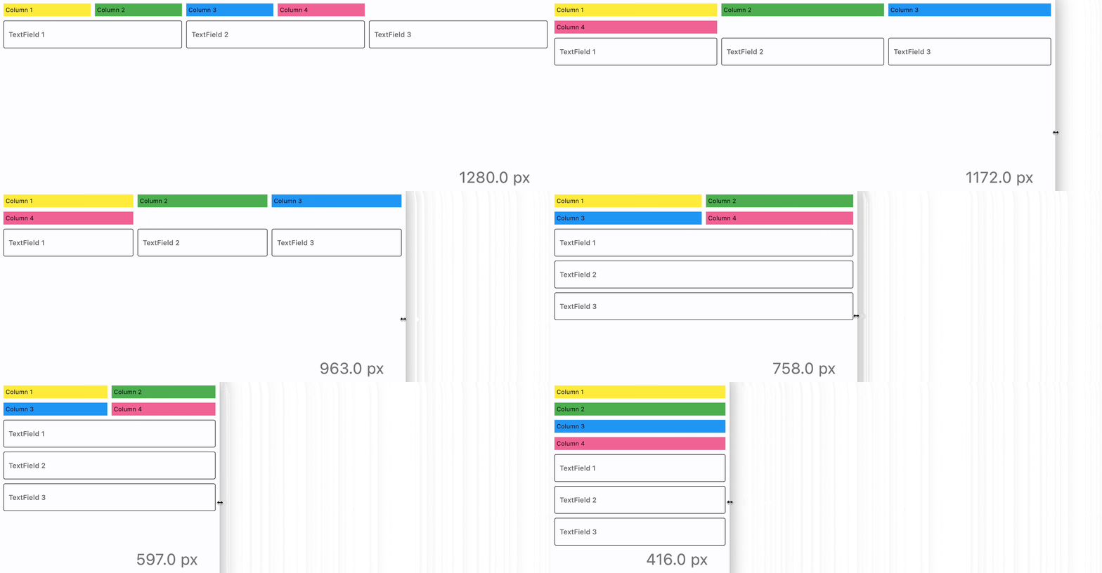
import flet as ft

def main(page: ft.Page):
    def page_resize(e):
        pw.value = f"{page.width} px"
        pw.update()

    page.on_resize = page_resize

    pw = ft.Text(bottom=50, right=50, style="displaySmall")
    page.overlay.append(pw)
    page.add(
        ft.ResponsiveRow(
            [
                ft.Container(
                    ft.Text("Column 1"),
                    padding=5,
                    bgcolor=ft.colors.YELLOW,
                    col={"sm": 6, "md": 4, "xl": 2},
                ),
                ft.Container(
                    ft.Text("Column 2"),
                    padding=5,
                    bgcolor=ft.colors.GREEN,
                    col={"sm": 6, "md": 4, "xl": 2},
                ),
                ft.Container(
                    ft.Text("Column 3"),
                    padding=5,
                    bgcolor=ft.colors.BLUE,
                    col={"sm": 6, "md": 4, "xl": 2},
                ),
                ft.Container(
                    ft.Text("Column 4"),
                    padding=5,
                    bgcolor=ft.colors.PINK_300,
                    col={"sm": 6, "md": 4, "xl": 2},
                ),
            ],
        ),
        ft.ResponsiveRow(
            [
                ft.TextField(label="TextField 1", col={"md": 4}),
                ft.TextField(label="TextField 2", col={"md": 4}),
                ft.TextField(label="TextField 3", col={"md": 4}),
            ],
            run_spacing={"xs": 10},
        ),
    )
    page_resize(None)

ft.app(target=main)
Other new controls
This release adds new visual and non-visual controls requested by Flet community and also required to build UI of the upcoming Flet Studio.
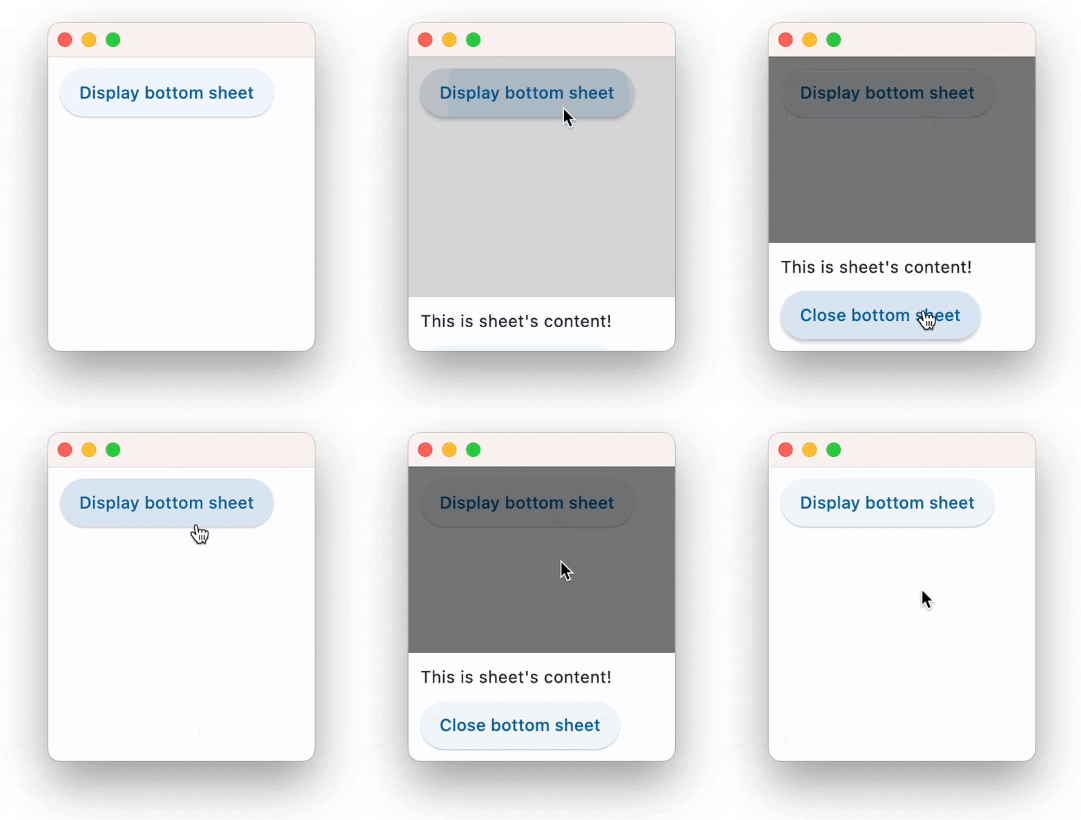
BottomSheet
Shows a modal Material Design bottom sheet:
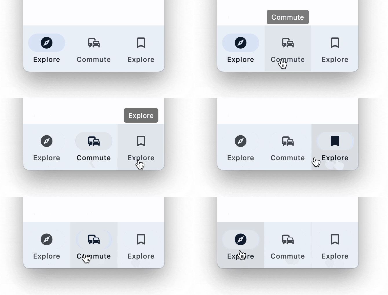
NavigationBar
Bottom Navigation bar which offers a persistent and convenient way to switch between primary destinations in an app:
Tooltip
A tooltip control:

HapticFeedback
Allows access to the haptic feedback (clicks and vibrates) interface on the device.
HapticFeedback docs.
ShakeDetector
A control to detect phone shakes. Based on shake widget.
ShakeDetector docs.
Other improvements
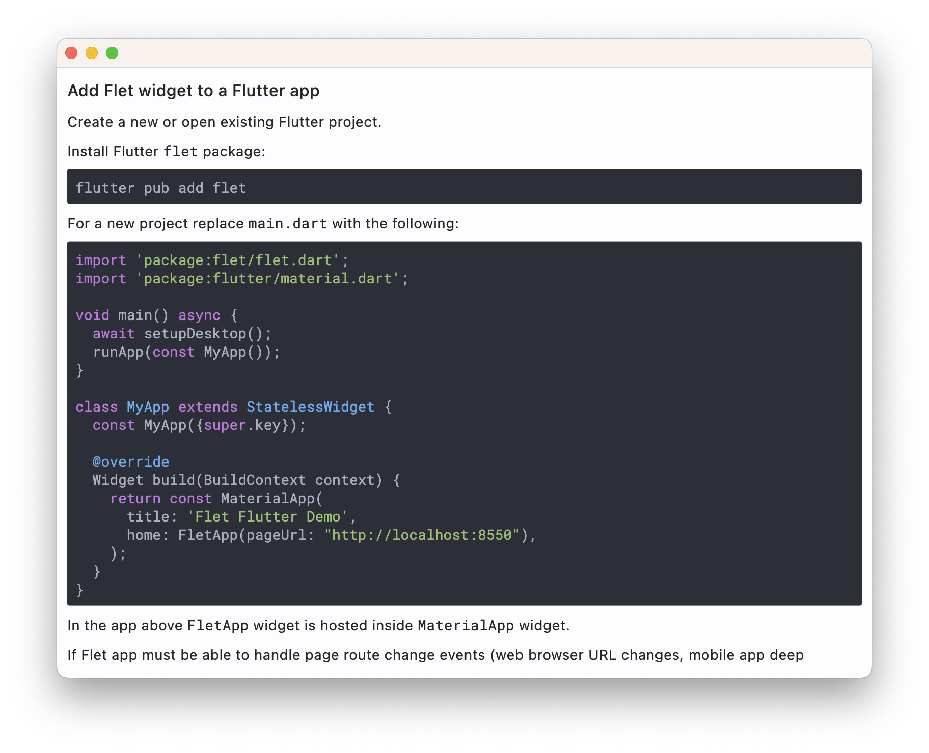
Markdown code syntax highlight
Variable fonts support
Flutter has finally supported variable fonts and we bring that into Flet too!

Upgrade Flet module to the latest version (pip install flet --upgrade) and let us know what you think!
Enjoy!