FilledTonalButton
A filled tonal button is an alternative middle ground between FilledButton and OutlinedButton buttons. They’re useful in contexts where a lower-priority button requires slightly more emphasis than an outline would give, such as "Next" in an onboarding flow. Tonal buttons use the secondary color mapping. See Material 3 buttons for more info.

Examples
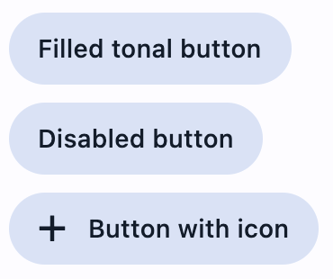
Filled tonal button
- Python
import flet as ft


def main(page: ft.Page):
    page.title = "Basic filled tonal buttons"
    page.add(
        ft.FilledTonalButton(text="Filled tonal button"),
        ft.FilledTonalButton("Disabled button", disabled=True),
        ft.FilledTonalButton("Button with icon", icon="add"),
    )

ft.app(target=main)
Properties
adaptive
If the value is True, an adaptive Button is created based on whether the target platform is iOS/macOS.
On iOS and macOS, a CupertinoButton is created, which matches the functionality and presentation of this button. On other platforms, a Material FilledTonalButton is created.
The default value is False.
autofocus
True if the control will be selected as the initial focus. If there is more than one control on a page with autofocus set, then the first one added to the page will get focus.
content
A Control representing custom button content.
icon
Icon shown in the button.
icon_color
Icon color.
style
See ElevatedButton.style for more information about this property.
text
The text displayed on a button.
tooltip
The text displayed when hovering the mouse over the button.
url
The URL to open when the button is clicked. If registered, on_click event is fired after that.
url_target
Where to open URL in the web mode. See Container.url_target for possible values.
Events
on_click
Fires when a user clicks the button.
on_hover
Fires when a mouse pointer enters or exists the button response area. data property of event object contains true (string) when cursor enters and false when it exits.
on_long_press
Fires when the button is long-pressed.