MenuBar
A menu bar that manages cascading child menus.
It could be placed anywhere but typically resides above the main body of the application and defines a menu system for invoking callbacks in response to user selection of a menu item.
Examples
- Python
import flet as ft
def main(page: ft.Page):
page.theme_mode = ft.ThemeMode.LIGHT
appbar_text_ref = ft.Ref[ft.Text]()
def handle_menu_item_click(e):
print(f"{e.control.content.value}.on_click")
page.show_snack_bar(ft.SnackBar(content=ft.Text(f"{e.control.content.value} was clicked!")))
appbar_text_ref.current.value = e.control.content.value
page.update()
def handle_on_open(e):
print(f"{e.control.content.value}.on_open")
def handle_on_close(e):
print(f"{e.control.content.value}.on_close")
def handle_on_hover(e):
print(f"{e.control.content.value}.on_hover")
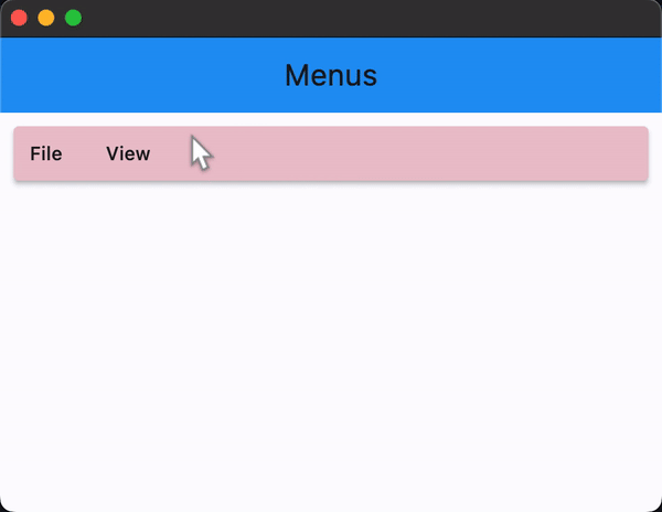
page.appbar = ft.AppBar(
title=ft.Text("Menus", ref=appbar_text_ref),
center_title=True,
bgcolor=ft.colors.BLUE
)
menubar = ft.MenuBar(
expand=True,
style=ft.MenuStyle(
alignment=ft.alignment.top_left,
bgcolor=ft.colors.RED_100,
mouse_cursor={ft.MaterialState.HOVERED: ft.MouseCursor.WAIT,
ft.MaterialState.DEFAULT: ft.MouseCursor.ZOOM_OUT},
),
controls=[
ft.SubmenuButton(
content=ft.Text("File"),
on_open=handle_on_open,
on_close=handle_on_close,
on_hover=handle_on_hover,
controls=[
ft.MenuItemButton(
content=ft.Text("About"),
leading=ft.Icon(ft.icons.INFO),
style=ft.ButtonStyle(bgcolor={ft.MaterialState.HOVERED: ft.colors.GREEN_100}),
on_click=handle_menu_item_click
),
ft.MenuItemButton(
content=ft.Text("Save"),
leading=ft.Icon(ft.icons.SAVE),
style=ft.ButtonStyle(bgcolor={ft.MaterialState.HOVERED: ft.colors.GREEN_100}),
on_click=handle_menu_item_click
),
ft.MenuItemButton(
content=ft.Text("Quit"),
leading=ft.Icon(ft.icons.CLOSE),
style=ft.ButtonStyle(bgcolor={ft.MaterialState.HOVERED: ft.colors.GREEN_100}),
on_click=handle_menu_item_click
)
]
),
ft.SubmenuButton(
content=ft.Text("View"),
on_open=handle_on_open,
on_close=handle_on_close,
on_hover=handle_on_hover,
controls=[
ft.SubmenuButton(
content=ft.Text("Zoom"),
controls=[
ft.MenuItemButton(
content=ft.Text("Magnify"),
leading=ft.Icon(ft.icons.ZOOM_IN),
close_on_click=False,
style=ft.ButtonStyle(bgcolor={ft.MaterialState.HOVERED: ft.colors.PURPLE_200}),
on_click=handle_menu_item_click
),
ft.MenuItemButton(
content=ft.Text("Minify"),
leading=ft.Icon(ft.icons.ZOOM_OUT),
close_on_click=False,
style=ft.ButtonStyle(bgcolor={ft.MaterialState.HOVERED: ft.colors.PURPLE_200}),
on_click=handle_menu_item_click
)
]
)
]
),
]
)
page.add(
ft.Row([menubar]),
)
ft.app(target=main)
Properties
clip_behavior
Whether to clip the content of this control or not. See Container.clip_behavior for possible values.
Defaults to ClipBehavior.NONE.
controls
The list of menu items that are the top level children of the MenuBar.
style
The value is an instance of MenuStyle class. MenuStyle allows controlling the menu's visual aspects, such as shape,
background and shadow colors, content padding, border width and radius.
Each individual style attribute could be configured for all or particular "Material states" of a menu, such as "hovered", "focused", "disabled" and others. For example, you can configure a different shape, background color for a hovered state and configure fallback values for all other states.
The following MaterialState values are supported:
HOVEREDFOCUSEDPRESSEDDRAGGEDSELECTEDSCROLLEDUNDERDISABLEDERRORDEFAULT- fallback state, meaning "all other states".
To configure style attribute for all Material states set its value to a literal (or class instance). For example, if you set bgcolor property to a literal the value will be applied to all menu states:
ft.MenuStyle(
    bgcolor=ft.colors.RED
)
To configure style attribute for specific Material states set its value to a dictionary where the key is state name. For example, to configure different background colors for HOVERED and FOCUSED states and another colors for all other states:
ft.MenuStyle(
    bgcolor={
        ft.MaterialState.HOVERED: ft.colors.WHITE,
        ft.MaterialState.FOCUSED: ft.colors.BLUE,
        ft.MaterialState.DEFAULT: ft.colors.BLACK,
    }
)
MenuStyle class
MenuStyle class has the following properties:
alignment- Defines the desired alignment of the submenu when opened relative to the button that opens it.bgcolor- The menu's background fill color.elevation- The elevation of the menu's Material.padding- The padding between the menu's boundary and its child.shadow_color- The shadow color of the menu's Material.shape- The shape of the menu's underlying Material, an instance of one of the following implementations:StadiumBorderRoundedRectangleBorderradius- border radius, an instance ofBorderRadiusclass or a number.
CircleBorderBeveledRectangleBorderradius- border radius, an instance ofBorderRadiusclass or a number.
ContinuousRectangleBorderradius- border radius, an instance ofBorderRadiusclass or a number.
side- An instance ofBorderSideclass, the color and weight of the menu's outline.surface_tint_color- The surface tint color of the menu's Material.