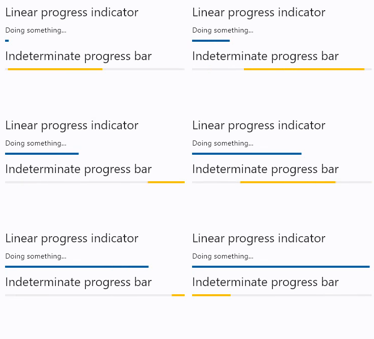
ProgressBar
A material design linear progress indicator, also known as a progress bar.
A control that shows progress along a line.
There are two kinds of linear progress indicators:
- Determinate. Determinate progress indicators have a specific value at each point in time, and the value should increase monotonically from
0.0to1.0, at which time the indicator is complete. To create a determinate progress indicator, use a non-null value between0.0and1.0. - Indeterminate. Indeterminate progress indicators do not have a specific value at each point in time and instead indicate that progress is being made without indicating how much progress remains. To create an indeterminate progress indicator, use a null value.
Examples
- Python
from time import sleep

import flet as ft

def main(page: ft.Page):
    pb = ft.ProgressBar(width=400)

    page.add(
        ft.Text("Linear progress indicator", style="headlineSmall"),
        ft.Column([ ft.Text("Doing something..."), pb]),
        ft.Text("Indeterminate progress bar", style="headlineSmall"),
        ft.ProgressBar(width=400, color="amber", bgcolor="#eeeeee"),
    )

    for i in range(0, 101):
        pb.value = i * 0.01
        sleep(0.1)
        page.update()

ft.app(target=main)

Properties
value
The value of this progress indicator. A value of 0.0 means no progress and 1.0 means that progress is complete. The value will be clamped to be in the range 0.0-1.0. If null, this progress indicator is indeterminate, which means the indicator displays a predetermined animation that does not indicate how much actual progress is being made.
bar_height
The minimum height of the line used to draw the linear indicator. Default is 4.
border_radius
The border radius of both the indicator and the track. See Container.border_radius for possible values.
Defaults to border_radius.all(0) - rectangular shape.
bgcolor
Color of the track being filled by the linear indicator.
color
The progress indicator's color.
semantics_label
The Semantics.label for this progress indicator.
semantics_value
The Semantics.value for this progress indicator.
tooltip
The text displayed when hovering the mouse over the control.